


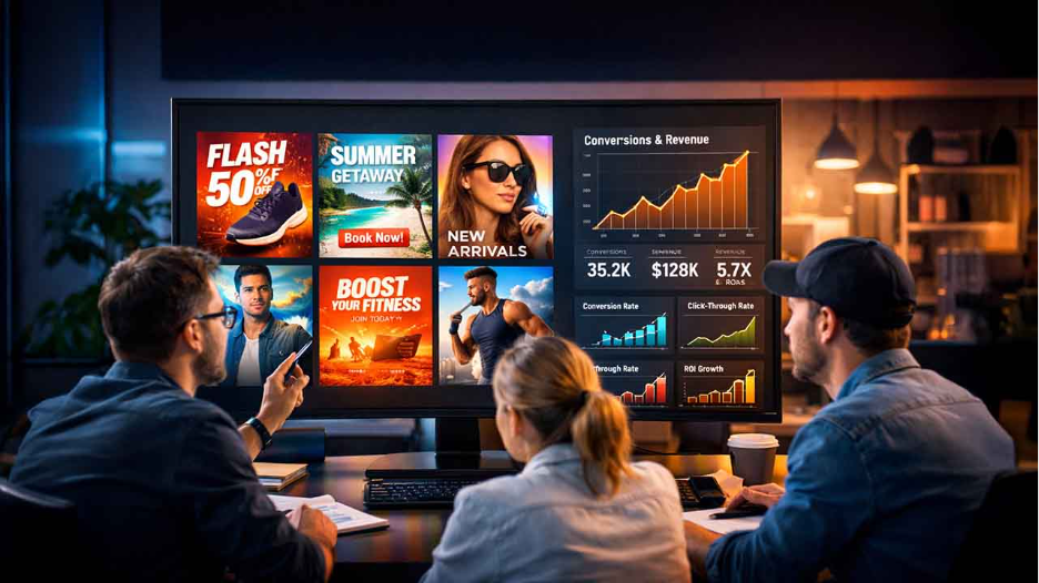
.png)
.png)
Most campaigns don’t fail because the offer is weak or the targeting is off. They fail because the target audience isn’t processing the message fast enough.
Before someone reads your headline or understands your value proposition, their brain has already decided whether to keep scrolling. And that decision is almost entirely visual.
That’s why visual content for campaign performance is important. Strong visuals compress meaning. They clarify intent, guide the eye, and signal relevance in seconds.
In this article, you’ll learn practical ways to use visual content to improve campaign performance across channels.
How to improve visual content for campaign performance
Here are my top tips for optimizing campaign performance using visuals:
1. Get the Message Right
When using visual content for campaign performance, be clear on what you want to say. Visual content performs well when it carries a single idea that the viewer can immediately notice.
If your creative asset tries to explain multiple benefits, speak to different audiences, or push more than one action, you dilute its impact. When you start with a clear message, the design becomes a delivery system, not a distraction.
In a nutshell, high-performing campaigns use creative visuals with clear messaging.
2. Design for How People Scroll

With the reduced attention span, I don’t expect you to design visuals for a calm, focused audience. You’re creating visuals for someone moving fast with their thumb. This is where you should pay attention to a few design principles.
For starters, contrast helps key elements stand out instantly, while hierarchy tells the eye where to look first. Typography also dictates how the design elements are perceived. With AI typography, you can determine which font weights and styles maximize readability on different screens.
In the example below, “introducing your new favorite” draws more attention compared to the other texts in the ad.
When learning how to use visual content for campaign performance, make sure it acts as a purposeful interruption. You want people to see your ad and take the desired action.
3. Use People and Emotion Strategically
Faces can be powerful when optimizing visual content for campaign performance, but only when they serve a purpose. This idea aligns closely with the Ashenaletuve design strategy, which emphasizes psychology and creativity. A person pointing toward your headline or actively using your product helps guide attention and adds context to the message.
Emotion should then reinforce what the visual is communicating, not exist on its own. You can use relief when showing a solved problem and curiosity when introducing a new idea. However, the emotion must match the audience’s situation.
Random stock-photo smiles without context don’t persuade. Instead, they blend into the feed and make your campaign look like every other one.
4. Keep Your Visuals Fresh
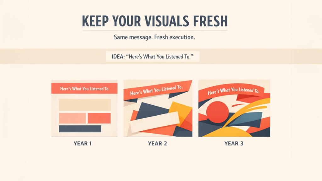
Writing great copy is essential, but visuals suffer from fatigue faster. Audiences stop noticing familiar imagery long before they stop responding to a message, which is why leveraging Image Search Techniques to discover fresh and relevant visuals is crucial. That’s why you should regularly refresh visual content for improved campaign performance.
Focus on elements that drive attention, such as subject choice, contrast, layout, and motion. These components keep your creative assets fresh and make your campaigns stand out.
Spotify’s annual Wrapped ads are a great example of refreshing visuals. It repeats the same idea every year: “Here’s what you listened to.” What changes is the visual execution, in terms of bold color palettes, new graphic styles, playful layouts, and fresh motion treatments.
Design tools like the banner maker option from Adobe allow you to quickly experiment with visuals. You can try out different professionally-designed templates and edit them from any device. This makes the design process far easier to sustain over time.
Before worrying about wording, your visuals need to earn attention in the first place. If they don’t interrupt the scroll, the copy may never get a chance to perform.
5. Treat Formats as Separate Campaigns
Resizing the same visual asset for every distribution platform is one way to flatten performance. Each channel rewards a different kind of visual behavior, and your creative has to adapt.
On Instagram and TikTok, vertical video with a fast hook, visible text, and human presence tends to perform well. LinkedIn favors clean layouts, clear headlines, and context-driven images that explain value. Display ads and banners are ideal when stripped down to one message.
Landing pages demand a different mindset altogether. Above-the-fold visuals should reinforce the promise of the ad, not introduce new ideas. Thankfully, automated branding platforms can now help you achieve visual consistency for each channel.
When you design with these differences in mind, visual content for campaign performance becomes more cost-effective. That’s because every asset is built for where people actually consume it.
6. Show the Outcome Alongside Your Product
People don’t buy things for what they are. Rather, they buy them for the problems they can solve. Visuals that show the result, such as how life looks after the click, create instant relevance. Take a look at this bathroom example:
A product in use, a problem resolved, or a realistic before-and-after moment helps the viewer imagine themselves benefiting.
7. Monitor Campaign Performance
After following all the design rules and steps I’ve discussed so far, go ahead and launch your campaign. However, the work doesn’t end there. You still have to check your performance metrics to learn how viewers are processing your ads.
If people view but don’t click, the message or call to action needs tightening. If they don’t stop at all, the hook or contrast may not be strong enough, or you’re not using the right format for the platform. And when clicks don’t turn into conversions, it might be that the ad’s promise doesn’t match the landing experience.
Treat every campaign as a feedback loop, and use those insights to optimize your visual content for campaign performance.
Conclusion
So far, I’ve shown you seven ways to improve visual content for campaign performance. Pick two or three ideas and start working on your creative assets.
When you treat visuals as part of the campaign strategy, every asset has a job to do. They attract attention, set expectations, and guide action.
However, all these won’t happen unless you design for real users. Let your campaign performance data help you make creative decisions that convert views to sales.
Frequently Asked Questions
Q1. How does visual content enhance marketing?
A1. Visual content enhances marketing by communicating ideas faster than text. It captures attention quickly and improves message retention. It also helps audiences understand value instantly and can increase open and click-through rates that lead to high conversion rates.
Q2. How can you optimize visual content for campaign performance?
A2. Follow these steps to optimize visual content for campaign performance
- Make sure your message matches the audience’s pain point
- Use creative elements that evoke emotions
- Align visual assets with the distribution platform
- Highlight product benefits instead of features
- Test creative assets regularly
- Use campaign performance data for future optimization
Q3. What are the 5 principles of visual design?
A3. The five principles of visual design are
- Contrast
- Hierarchy
- Alignment
- Repetition
- Balance
Together, they guide attention, improve readability, create consistency, and ensure visual elements work together to communicate information.

.png)