
.png)
.png)
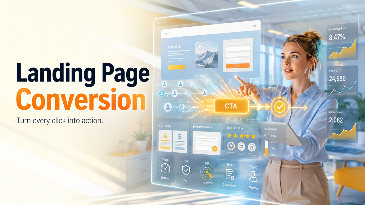
Every marketer wants as much as traffic. But traffic without conversions is just noise. A landing page that pulls thousands of visitors a day and converts none of them is, in every practical sense, considered a failure. Let’s discuss what landing page conversions actually are and how to improve them.
What Is a Landing Page Conversion?
A landing page conversion happens when a visitor completes a certain action you've designed your landing page around. This action can be filling out a contact form, signing up for a newsletter, booking a product demo, registering for a free trial, making a purchase, or even just picking up the phone and dialling the provided number on the landing page.
These actions basically fall into two categories. Macro conversions are the primary goal: purchase, signup, booked call. However, micro conversions are the smaller steps that point to interest, like scrolling through the page, clicking a video play button, or navigating the pricing section.
We agree traffic is necessary, but conversions are what pay the bills. A page with 500 visitors and a 10% conversion rate outperforms a page with 5,000 visitors converting at 0.5%. Every time.
What Is a Landing Page Conversion Rate?
Your conversion rate is calculated simply:
Conversion Rate = (Conversions / Total Visitors) x 100
So if 1,200 people visit your page and 84 of them fill out your form, your conversion rate will be 7%.
What conversion rate counts as "good" varies by industry. For instance, eCommerce pages typically convert between 1 and 4%. SaaS free trial pages can hit 5 to 10% when the offer is compelling. B2B lead generation pages often land between 2 and 5%, depending on the quality of traffic and the Ask.
High traffic numbers can cover a broken page. If your bounce rate is high and your conversion rate is low, the page is not doing its job, no matter how many people land on your page.
How Landing Pages Work in the Customer Journey
A landing page exists in the centre of the funnel. It’s a page people land after clicking something they saw, like Google ads, your email link, your social post, or a CTA button. They land somewhere with a specific expectation in mind, and that expectation was set by whatever they clicked.
This is where most of the landing pages end up failing silently. A user clicks an ad about "affordable CRM software for small teams" and lands on a generic homepage. The connection breaks. The intent does not match the destination. In the end, the users leave.
On the other hand, effective landing pages work as a direct continuation of the conversation that started in the ad, email, or search result. The message carries through. The offer is front and center. And the next step is obvious. Simply, when the expectations meet, the users take action after landing on the homepage.
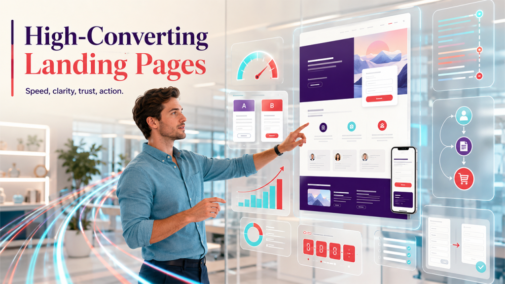
What Makes a Landing Page Convert?

A Clear Value Proposition
Before anything else, a visitor should be able to understand what you're offering and why it matters to them, within the first few seconds after landing on your page. Not wandering back and forth on other pages.
A strong value proposition answers three questions immediately: What is this? Who is it for? Why should I care? If your headline makes someone think too hard or make them feel overwhelmed or confused, you've already lost some of them.
Headlines That Pull People In
Your headline is the first thing a visitor reads and the first thing that shapes their decision to stay on your page or leave. The best headlines are short, specific, benefit-driven, and direct. For example, "Double Your Email Open Rate in 30 Days" outperforms "Welcome to Our Email Marketing Platform" every single time.
Avoid being clever at the expense of being clear. Clarity converts.
A Call-to-Action That's Impossible to Miss
One page. One goal. One primary CTA. That's the formula.
Your call-to-action button should stand out visually, always use action-oriented language ("Start My Free Trial" beats "Submit"), and appear at logical points throughout the page, not just at the bottom after a wall of text. It should be visible clearly on the landing page.
Trust Signals That Do the Convincing
People are sceptical, and nothing wrong with that. Your job is to create trust, not assume it.
Testimonials, star ratings, client logos, security badges, and case study snippets all do this work for you. Using real names and photos on testimonials carries more weight than any anonymous quote.
Moreover, Industry certifications and press mentions add legitimacy. If others trust you, a new visitor has a reason to trust you as well.
Design That Gets Out of the Way
A cluttered page can overwhelm the visitor, leading to leave the page in a few seconds. Good landing page design uses white space, clear visual hierarchy, and a layout that guides the eye naturally toward the CTA.
Since more than half of the web traffic comes from mobile devices, Mobile responsiveness is non-negotiable. A page that looks broken on a phone will reduce conversion. Also, page speed matters just as much. A one-second delay in load time can drop conversions by 7%.
Types of Landing Pages
Not all landing pages are designed the same. They are designed differently for different purposes. Lead generation pages capture contact information in exchange for something valuable, like an ebook, a webinar spot, or a free audit. Click-through pages warm visitors up before sending them to a checkout or signup flow.
On the other hand, sales pages aim to convince someone to buy without a sales call in between. Product launch pages create anticipation and capture early interest. They highlight product features, benefits, offers, or even signups.
Local service pages are built for geographic relevance, often featuring click-to-call buttons and map embeds. The goal is to generate direct calls, inquiries, or bookings from local customers.
Each landing page type requires a slightly different approach, but the core principles stay the same, i.e., conversion.
Landing Page Conversion Rate Optimization Tips
Speed First
Low speed leads to low conversion. If your page takes more than three seconds to load, you're losing visitors before they've seen a single word. Hire a good developer who can find and fix all root causes behind it.
Simplify Your Forms
Every additional field you add to a form reduces the likelihood of completion. Ask for only what you genuinely need at this stage. You can always gather more information later. Multi-step forms often outperform long single-step forms because they feel less intimidating. The commitment builds gradually.
Make Mobile the Priority
Design for the smallest screen first. Buttons should be large enough to tap without zooming. Text should be readable without pinching. The CTA should be visible without excessive scrolling.
Add Real Urgency
Remember, people nowadays are very smart. So, urgency works only when it looks genuine. A limited-time discount with a countdown timer motivates action. Fake urgency, like timers that reset when you refresh the page, breaks trust in your business the moment someone catches on.
Match the Message to the Traffic Source
Someone coming from a Google search for "best project management tool for freelancers" has different expectations than someone clicking a retargeting ad. Tailor your landing page messaging to the audience segment that's arriving. Dynamic content tools can help automate this at scale, especially when promoting a project management platform to highly targeted user groups.
The Role of A/B Testing
Optimization without testing is just guessing with extra steps. A/B testing means running two versions of a page at the same time, changing one element at a time, to see which performs better with real visitors. You can test headlines, CTA button copy, image choices, form length, page layout, and color contrast.
The key is patience. Ending a test too early, before reaching statistical significance, leads to bad conclusions. Test one variable at a time so you know what actually moved the needle. Small, consistent improvements compound over time into meaningful conversion lifts.
Key Metrics to Watch
Conversion rate is the headline number, but it does not tell the full story. Bounce rate tells you how many people left immediately. Time spend on page shows engagement. Scroll depth reveals whether visitors are even reaching your CTA.
Form abandonment rate is particularly useful. If visitors are starting to fill out your form but not finishing, the form itself is the problem. Cost per conversion ties your results back to actual business economics.
The Landing Page Optimization Checklist
Before any page goes live, run through this:
- Headline is clear and specific
- Value proposition answers "what's in it for me" immediately
- CTA is visible, prominent, and action-driven
- Page loads in under three seconds
- Mobile experience is clean and functional
- Trust signals are present and credible
- Navigation is minimal or removed entirely
- A/B testing is set up and ready to run
Smarter Landing Page Decisions Lead to More Conversions
Landing page conversion optimization is not a one-time project. It's an on-going process of testing, learning, and adjusting. The best-converting pages today were almost certainly worse six months ago.
Start with fixing your headline first. Then simplify your form. Speed up your load time. Finally, test what you changed. Let the data tell you what works, and build from there.
The goal is not a perfect landing page. It's a better one than you had yesterday.